S1-22 : THRILLER PROJECT 2008/9

Monday, 10 November 2008

Finished Title Sequence

Sunday, 2 November 2008

Filming

As our film doesn't include long scenes of footage or complicated settings it was easy and quick to film.
We filmed on 3 separate occasions.
The first was a lunch-time in which Alex, Rachel and Charlotte filmed the wrist shots. We used all of the lesson time (longer than we expected) to prepare the scars and make-up so therefore had to film during lunchtime.
The second was during a free lesson. Alex and Rachel filmed the yearbook/phone book shots in the media studio. The media studio was an ideal location as it was very dark and we could set up the lighting effectively.
The third was an evening after college. Alex, Rachel and Charlotte filmed the rest of the footage at Rachel's house. It was easier to do the rope/tummy/mouth shots in this situation as it didn't involve having to get changed etc in college/during lesson.


Labels:

Monday, 20 October 2008

Storyline

Reading through our blog we realised that we have never properly explained our storyline, which may make some of our ideas quite confusing. Although we are only making the title sequence, we need to know where the film is going so we can show relating imagry in our title sequence.
Our film is called "The Yearbook". It is about a man who was bullied as a child by other children at his school. Now, as a 25 year old adult, he is determined to get revenge on the people who made his life misery by one by one killing everyone in his school year book. Our main character is a lady who is the last to be murdered. The film follows her terrifying journey as she enjours the tourture he plays on her mind.

Labels: ,

Titles

Here is some notes we made about the desired style of our titles.

Font
We would like to use a childish looking font to reflect the childrens laughter. The childish font relates to how it is the murderers childhod that has provoked all of the murders within the film.
Here is a few initial ideas for font types:


Colour

We are going to use white. This represents his clear, naive and innocent ideas when young against the dark and disturbing images (shown behind) of his adulthood.

Size

The sizes will vary as each title will flicker and move between the ranges of size 10-size 18.

Position

The title will appear in different places depending on its relationship with other aspects of the shot. It will very rarely be central within in the shot. This will help to distort, alter and adjust the mise-en-scene of each shot.

Action

The title will flicker and blur. It will be un-focus and re-focus within the shot.

Duration/Speed

The title will flicker and move quite quickly but the wording itself will be on the screen for an approximate duration of 3-4 seconds.

Transitional Effects

The title will just appear within the shot.

Labels:

BLOG OF THE WEEK :D

As of yesterday, we are currently blog of the week :]
We're all very pleased!

Friday, 17 October 2008

First filming shots

These are our very first shots which we filmed yesterday. We will cut these down, like in our animatic, for the final title sequence. As we are still getting used to the equipment and style of filming, some of the shots did not go to plan, so we will not use them. Here is how our first ever day of filming went:

Labels:

Make up preparation

The first shots we decided to film were the ones of a girl slitting her wrist. We used the makeup that we brought in town to make it look it look as realistic as possible. It was quite difficult to apply, but we think we achieved the desired effect. We used Alex's wrist and the rest of us applied the stage makeup.
Here are some pictures of us applying the stage makeup.
We used the fake skin and scar makeup to create the first and largest cut

We applied the fake blood to make the wound look more realistic

This was our first completed scar.

We then repeated this process to make a second scar.
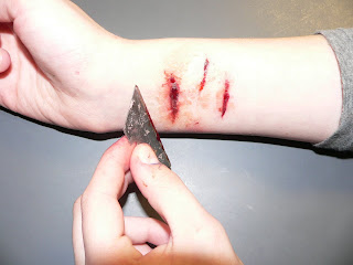
We did this for a final time to create a third scar. Then we put more blood around the scars to make the skin look red and sore. We think having three scars makes it look more realistic than just one. We are very pleased with our final effect.

Labels:

Wednesday, 15 October 2008

Title sequence sounds

As we havn't yet put any music or sounds to our animatic, we have been looking in class at possible non-diagetic and diagetic sounds for our title sequence.

Non-diagetic sounds we are considering using are:

Children's laughter: We will use this at the very begining of our title sequence, and it will suddenly stop as you see the picture scribbled out. We want this to be the very first sound our audience will hear as it immediatly suggests our film's storyline. It will show that the laughter of the children who bullied our main character is still haunting him.

Scratching: We will use this sound while any picture or name is being circled or scribbled out. As this is quite an unpleasant sound, it will put the audience on edge, creating our desired effect.

Razor Blade:We may use the sound of a razor blade, which is a hard sound to describe, as an audience would automaticaly associate this sound with death.


We want to use diagetic sounds during our title sequence which will make our audience anxious. This means it will have a strong beat, almost like a heart beat, and we will maybe use high pitched screeching sounds over the beat. Like the scratching, this is an unpleasant sound for the audience to hear, making the audience even more on edge.

Labels:

Props

Here is an initial basic prop list (I'm sure, however, that we will end up adding stuff as we begin to prepare for our rough cut):

*Address Book/Phone Book
*Year Book
*Book of photographs (historical images relating to torture)
*Needle
*Razor Blade
*Rope
*Book or Diary
*Fake Blood/Scars etc 

Me and Rachel went into town and bought the following things:

 
(Fake Skin)
(Fake Blood)
(Fake Scars)

Labels:

Thriller Animatic

Animatic first edit (without music)
-We made our animatic move in a fast jumpy style because that is the pace and style that we want our final title sequence in.
-We focused very much on the time length of each shot, as the combination of fast jumpy shots and slow zooms puts the audience on edge.
-Our final piece will be slightly longer as we will be adding more titles.
-For each piece of footage we will take a series of shots from different angles and distances, we will then put them together to create the jumpy distorted effect.
-We are quite pleased with our finished animatic as it is a good representation of the images and effects we want to portray in our final title sequence.


Animatic Feedback

We asked people in our class what they thought of our animatic. This is what some people said:

"Needs music but I like the flashing images. It was a bit too quick to read" - Robbie French & Andy Jones

"I like how the shots are jumpy and the duration of the shots, it's really good" - Ashley Foster

"I think that it is a very effective animatic, particularly the extreme close ups. You've obviously put a lot of thought into the images which will be in your animatic. I feel you've straight away got the concept of what a title sequence is meant to achieve." - Emma Culley (Media teacher)

From this feedback, we can confidently say that people generally like our animatic. We now see that we maybe should make our titles a little longer so they are more clear to read. Also, we need to put music too our title sequence. We're pleased that people like the pace, as this is the main effect we desired.


Labels:

Storyboard

I collaborated the ideas our group had discussed and drew a storyboard that included shots similar to those that will be in our final title sequence.
It was these images and sketches that we used within our animatic.

The shots were not in any particular order as the title sequence is going to be so rapid and fast that all the shots will be repeated and short clips will be shown in a variety of orders.

Within each shot i used arrows to show any key action or movement. Beneath each shot I listed any key sound, lighting or angles that would be used within it. 

Labels:

Thursday, 9 October 2008

Influencial sounds for final piece


This music video is by the current rock band Deftones, there song Change in the house of flies, is a great influence as we began to notice that most horror and thriller films tend to use rock bands as there opening sound track during there title sequence.
The reason we like Deftones song is because it starts with a calm ambience and then bursts into a hetic chorus. This attracts the audience's attention.

Labels:

Monday, 6 October 2008

Saul Bass

SAUL BASS (1920-1996) was not only one of the great graphic designers of the mid-20th century but the undisputed master of film title design thanks to his collaborations with Alfred Hitchcock, Otto Preminger and Martin Scorsese.
After apprenticeships with Manhattan design firms, Bass worked as a freelance graphic designer or "commercial artist" as they were called. Chafing at the creative constraints imposed on him in New York, he moved to Los Angeles in 1946. After freelancing, he opened his own studio in 1950 working mostly in advertising until Preminger invited him to design the poster for his 1954 movie, Carmen Jones. Impressed by the result, Preminger asked Bass to create the film’s title sequence too.
In 1958’s Vertigo, his first title sequence for Alfred Hitchcock, Bass shot an extreme close-up of a woman’s face and then her eye before spinning it into a sinister spiral as a bloody red soaks the screen. For his next Hitchcock commission, 1959’s North by Northwest, the credits swoop up and down a grid of vertical and diagonal lines like passengers stepping off elevators. It is only a few minutes after the movie has begun - with Cary Grant stepping out of an elevator - that we realise the grid is actually the façade of a skyscraper.
Assisted by his second wife, Elaine, Bass created brilliant titles for other directors - from the animated alley cat in 1961’s Walk on the Wild Side, to the adrenalin-laced motor racing sequence in 1966’s Grand Prix. He then directed a series of shorts culminating in 1968’s Oscar-winning Why Man Creates and finally realised his ambition to direct a feature with 1974’s Phase IV.

Here is a video with Saul Bass himself talking about his previous titles that he has composed.

Labels:

Editing analysis

Quatro 38
Director:
Thomas Edward Hale
Released:
June 23rd 2008


Editing is cleverly used in this title sequence to make the audience feel uneasy and jumpy. The quick jumping movements between the shots gives the viewers the feeling of panic and danger, many jumpcuts are used. The pace of the title sequence is very fast, which with the jumpcuts makes it very effective.
The graphical image used while the titles appear of a blood like puddle appearing accross the screen adds suggests to the audience that death and blood will have key roles in this film.

Labels:

Titles

Whilst we were drawing our storyboard, we began to think about the credits we would need to include in our titles. We listed a group of the most commonly used ones which we found by watching other thriller title sequences. We will include:
  • Company name: eg. ____ Presents
  • A film by _____
  • Actors (Main characters)
  • The film name
  • Rest of actors
  • Casting by _____
  • Music by _____
  • Costumes designed by _____
  • Edited by _____
  • Production designed by _____
  • Director of photography _____
  • Co Producers _____
  • Co executive producers _____
  • Executive producers _____
  • Written by _____
  • Produced by _____
  • Directed by _____
This will help us to time our title sequence effectively and will help us to prioritise the order which the names will appear. This will make our editing overall easier.

Labels:

Title Sequence Analysis 2

Vertigo
Director: Alfred Hitchcock
Released: 1958


This title sequence mainly uses non-diagetic sound to create an atmospehere. The director has used slow, mystical music throughout the title sequence which gives the audience a sense of mystery, it is also typical of the time period to use such music for opening a thriller. A much faster pace than this would be used in a more modern thriller.
There is not much iconography used in the way of images to show the audience that the movie is a thriller, although one convention used is an extreme close up of a face, and then an eye. The image of the eye is shown in red, which suggests danger and possibly death to the audience. Other images used are graphical rather than of people. Swirly patterns of blue and pink appear over the background while the titles appear, these patterns suggest mystery, as does the music, but they don't really give the audience an impression of what is to come in the film.
The background is black throughout the sequence, which creates a dark and gloomy atmosphere.
From this title sequence, it is hard to tell what the rest of the movie will be about. This is a technique the director could have used so the audience were left wanting to know more.

Labels:

Sunday, 5 October 2008

Mise-en-Scene Analysis

Here's some mise-en-scene analysis of the title sequence from the somewhat dated thriller film "The Shining".

The Shining
Director: Stanley Kubrick


Initially i thought that mise-en-scene didn't play a vital part in this title sequence. However, after thinking about the theme of the film I could see how elements of it were reflected in the setting used etc. Throughout the title sequence the audience follows a car as it journeys through a vast and deserted area of mountains and trees. This unknowingly sets the audience up for a key event later in the film; this being when the family move into a similarly deserted hotel. The tension and suspense the audience feel throughout the title sequence(awaiting a climax or event)is similar to the suspense they later feel as the family explore the hotel. The car somewhat lost within the huge setting represents how minute the family is in comparison to the events and characters around them later in the film. The heaviness of the forest areas around the car make it seem enclosed and captured. All of these suggestions made within the title sequence represent a feeling/event later to come and provoke emotions in the audience that will develop throughout the film.

Labels:

Camera work Analysis

For our homework we were assesed to choose a thriller movies's title sequence of our choice and to analysis it. I chose Panic room directed by David Fincher whom is famous for his action packed films.
Diretor: David Finker
Year: 2002


The Camera swerves through the buildings of New York city giving birds eye and high angle shots. The cameras colour vibrancy is only grey and dull concluding to the impersonality of the buildings. Throughout the opening sequence a characterless vibe is given out by the slow motion and movement of the camera exposing the scenery, almost feels as this stillness is about to be broken.

The edited features which are added on to the original shots such as the directors ,and actors names casually blend in. For the majority of the sequence a human presence is a dim and vague. The use of such a typical big town like New York city gives of the impression of hectic life but the result is very much the opposite, as there is very little human presence shown, possibly symbolising the lack of care of each individual.
This title sequence doesn’t give much idea of what the film is going to be like, so either the audience will be eager to find the following plot or already bored and disappointed by there expectations therefore wont pay much attention.

Charlotte.T

Labels:

Sound Analysis

For our homework we were asked to analyse a thriller opening title sequence. As a group we devided up the different catorgories and all chose one to write about. I will be writing about the sound and how it tells the audience what the film will be about and how it builds suspence.

The Ring 2002
Director: Gore Verbinski


At the start of the title sequence they have used what sounds like a childs jack in the box tune, but it is distorted, this would make the audience feel uncomfortable as it gives a spooky effect for the on coming film. This also gives the audience the idea that in the film the will be children or a child.
As the music gradualy changes the beat of the music sounds like a heart beat getting faster and faster this gives the audience a visceral reaction as there heart beat will match the speed of the music's.
The non-diagetic sounds such as the high pitched noise which happens occasionally throughout the music may put the audience on edge as they could now guess that the genre of the film is going to be thriller/horror.
As the intensity of the music dies down, the music changes back into the childs jack in the box tune but this time has children laughing over the top of it along with more high pitched sounds, this would make the audience feel uneasy therefore creating suspence.

Labels:

Friday, 3 October 2008

Title Sequence Analysis

Here is our analysis of a thriller title sequence from a well-known film.

Se7en
Director: David Fincher
Released: 1995


During this title sequence Fincher has used iconography to symbolise the theme that runs throughout the film. An example is when the spectator is shown a flickering image of a razor blade. The connotations of this are danger, threat, death and fear. This creates a visceral reaction within the audience as they begin to feel tense in preparation for the rest of the film. Other images used to create the feeling of threat and danger are the constant flashes of photographs and newspaper cuttings; faces and words being rapidly crossed out. All of the shots used are close-ups therefore only giving the audience clues rather than showing exactly whats happening. These influential images suggest to the audience the genre of the film and the events that will occur.
Sound also plays a key role in presenting this. The music is initially quite gloomy and low in contrast to the screeching sounds that follow. These non-diagetic sounds make the audience feel uncomfortable and anxious.

Labels: , ,

Thursday, 2 October 2008

Welcome

Hello!
Our group is:
Rachel
Charlotte
Alex
Tiffany

INITIAL IDEAS !
As we are making a title sequence for a thriller film, we should decide what the film would be about if we were to make the whole film. This is so we can use imagery and sound to suggest the coming storyline throughout the title sequence.
After much discussing and changing ideas we have come to a first decision on what our storyline is.
It will be about a man who was bullied throughout his childhood by other children at his school. Now, as an adult, the laughter is still haunting him, so he goes through his school yearbook and decides to one by one kill the people who had made his life a misery.

Labels:

S1-22 : THRILLER PROJECT 2008/9